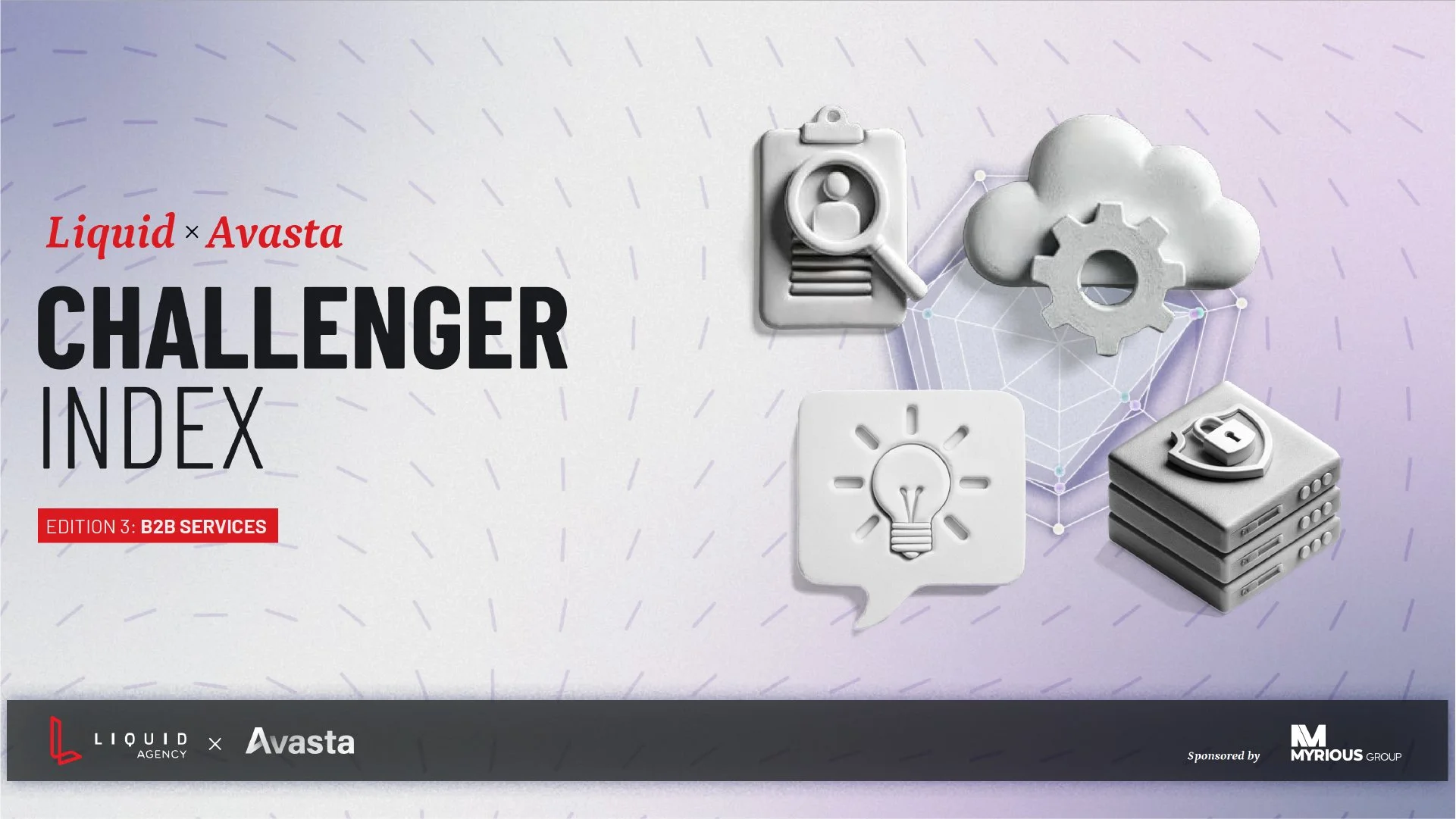
The Liquid x Avasta Challenger Index
Challenge:
Liquid Agency and Avasta partner twice a year to produce research-driven, thought leadership–rich digital white papers on emerging consumer trends. When I joined the project, only one edition had been published. While it met the basic requirements, the design left much to be desired—it read more like a phonebook than an engaging, insight-driven document.
Adding to the challenge, this is a joint effort between two distinct organizations with very different brand systems. My task was to create a new visual identity and layout that would feel like a true collaboration—a balanced blend of both brands.
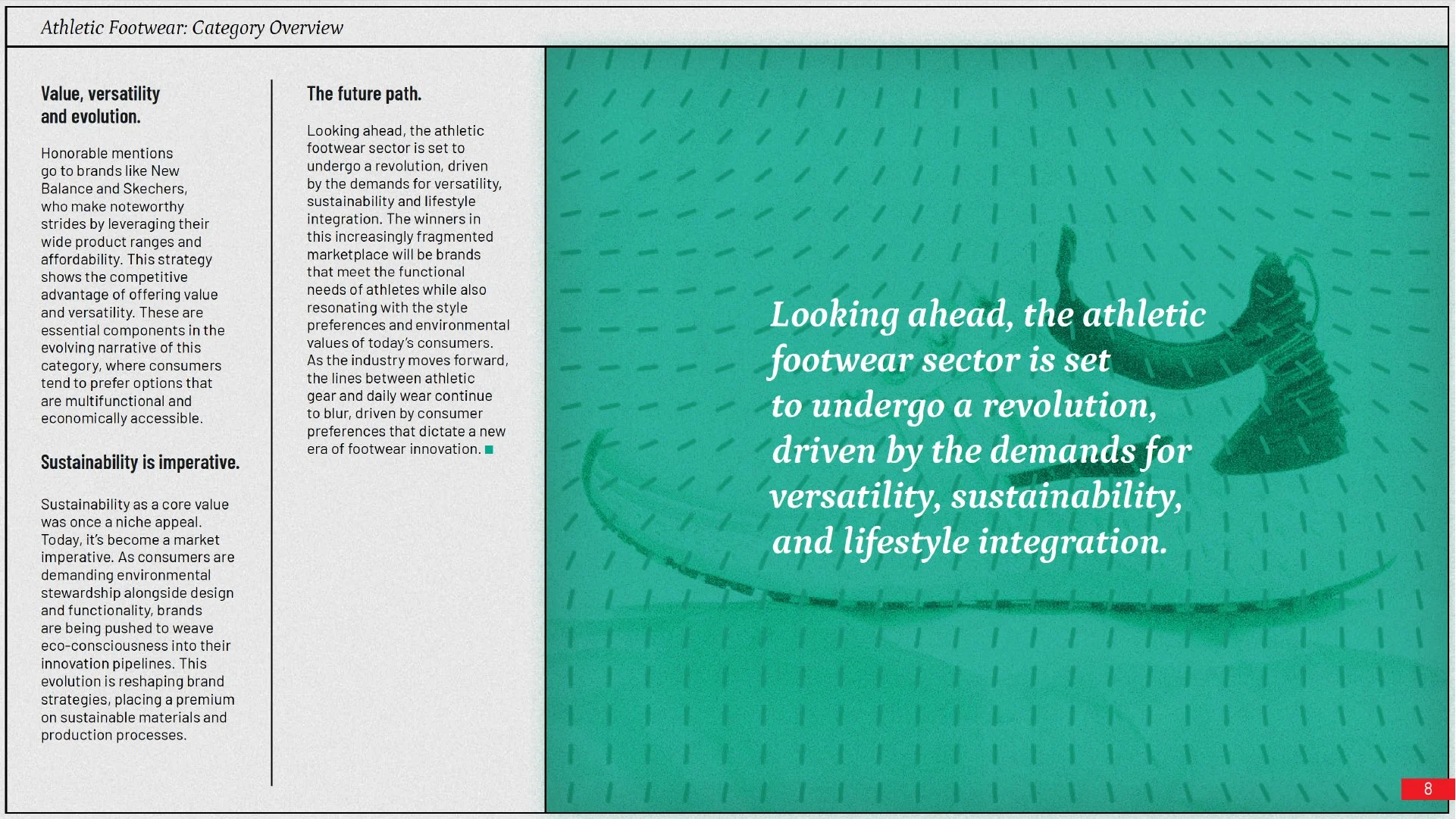
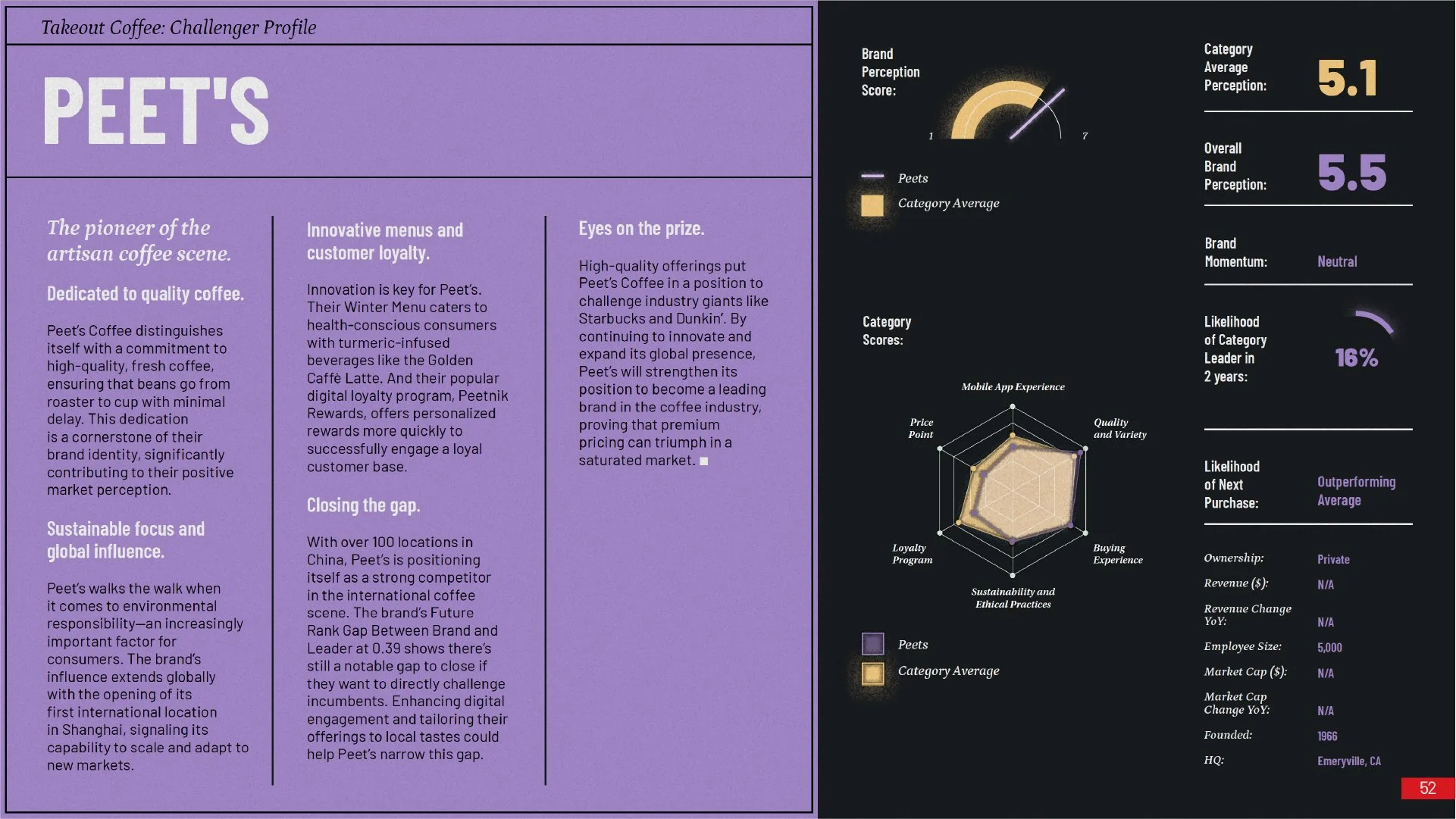
This new design system also needed to be highly adaptable. Each edition focuses on a different set of consumer categories, ranging from familiar B2C sectors like athletic shoes and electric vehicles to more conceptual B2B topics like HR services and cybersecurity. Whatever illustration style we chose had to be both flexible and repeatable.
Solution:
Working alongside creative director Jessae Brown, we began by gathering a wide range of creative inspiration and organizing it into distinct "design territories"—each exploring unique approaches to typography, color, illustration style, and data visualization.
We then prototyped layouts for each territory and tested them with stakeholders. The initial feedback was positive—the new direction was far more engaging and legible—but we were encouraged to better integrate the DNA of both brands.
With guidance from creative director Jon Irwin, we refined the concept:
We landed on a color palette built around shades of grape—a visual midpoint between Liquid’s signature red and Avasta’s blue—supported by secondary colors from both brand systems.
For typography, we anchored the system in Liquid’s established typographic style for consistency.
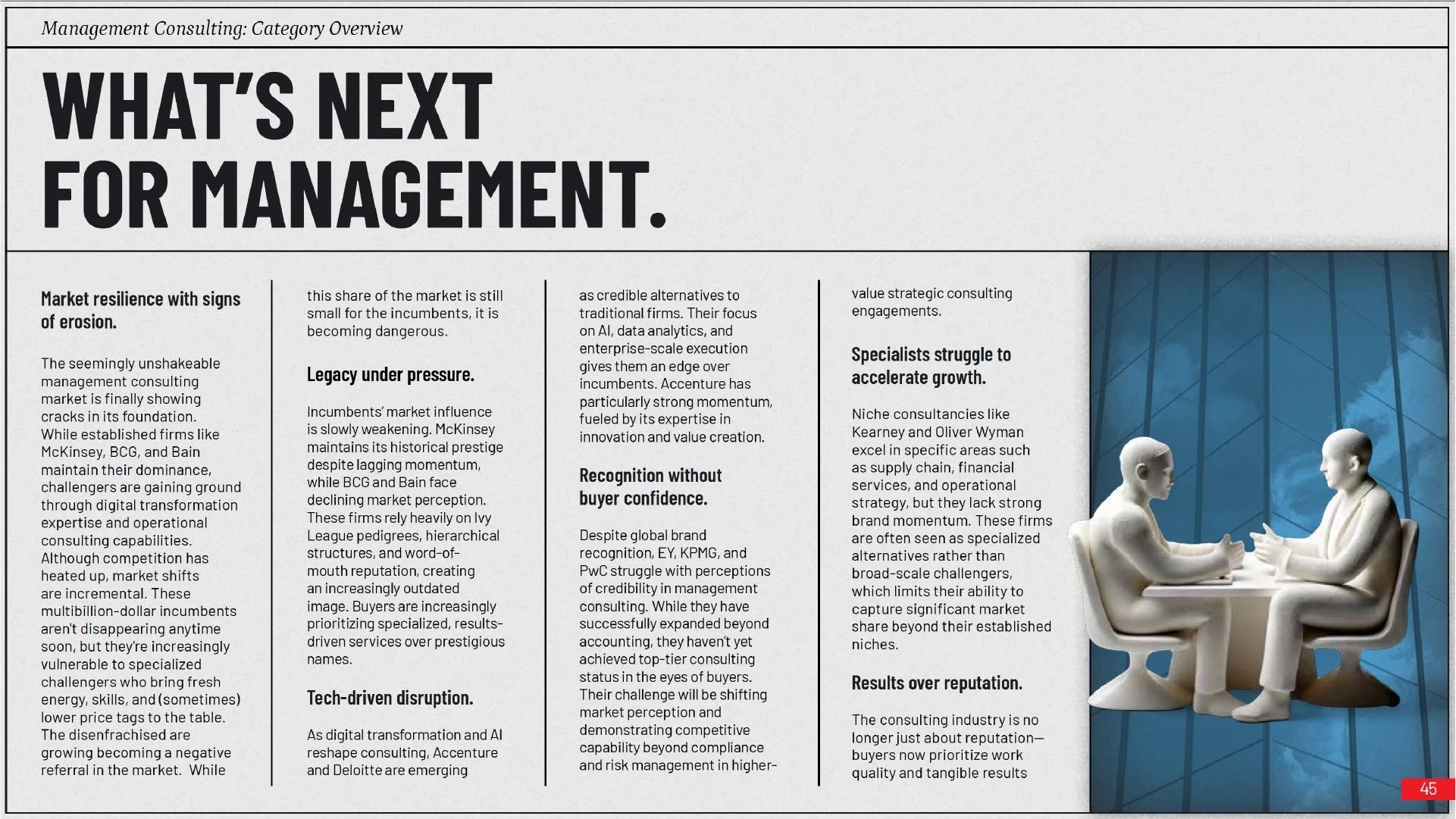
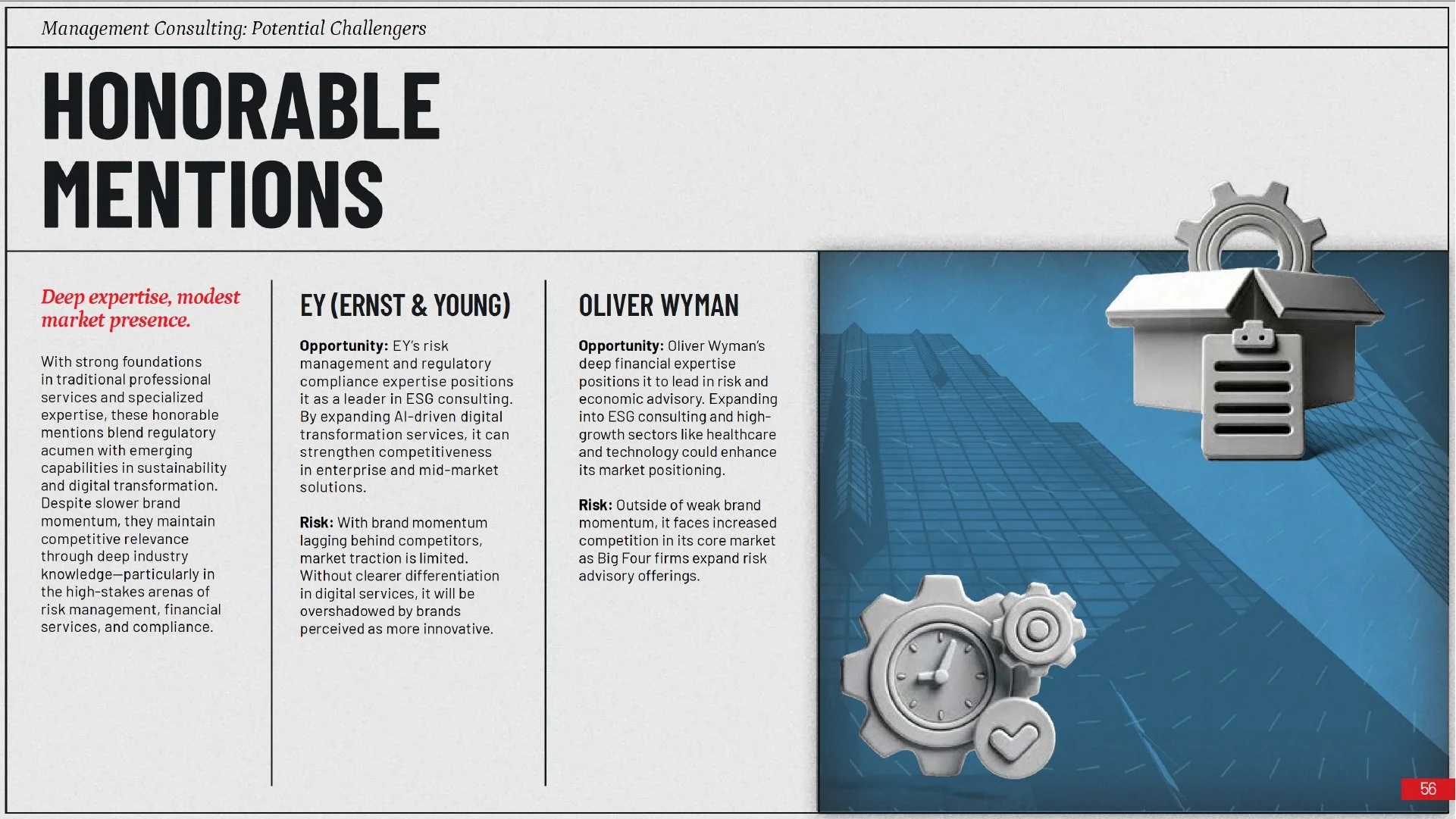
Most excitingly, we developed a distinctive illustration approach using AI-assisted 3D modeling. Each object was rendered in the same white clay-like material, providing a consistent yet flexible visual system that could adapt across categories while maintaining a strong, unified aesthetic.


Post-launch Promotion:
After the successful launch of the newly designed Challenger Index, we quickly pivoted to creating explanatory content to help promote the report. This included producing an entire video series as well as supporting social media content.
The interview content had been shot remotely by a third-party without any art direction, so the raw footage needed quite a bit of polishing. After ample color-correction, I selected a license-free audio track, created a motion graphics introduction sequence, and edited and produced a total of 10 videos as a part of the Challenger Index series—each video exploring questions tailored to different audiences.
